Power calculation for difference in proportions
code{white-space: pre;}
pre:not([class]) {
background-color: white;
}
if (window.hljs && document.readyState && document.readyState === “complete”) {
window.setTimeout(function() {
hljs.initHighlighting();
}, 0);
}
.main-container {
max-width: 940px;
margin-left: auto;
margin-right: auto;
}
Power calculation for difference in proportions
M Loecher
Friday, September 26, 2014
I almost posted the following on stackexchange, but as so often before, the process of writing down my question led to its natural resolution!
Dear all, I am trying to understand the origin of the actual formula used to compute the power of the power.prop.test() function in R, which is defined in lines 12-14 of the source:
 tside <- switch(alternative, one.sided = 1, two.sided = 2)
 p.body <- quote(pnorm(((sqrt(n) * abs(p1 - p2) - (qnorm(sig.level/tside,
        lower.tail = FALSE) * sqrt((p1 + p2) * (1 - (p1 + p2)/2))))/sqrt(p1 *
        (1 - p1) + p2 * (1 - p2)))))
I took the liberty of rewriting the expression inside the pnorm() function in readable notation: \[
\frac{ \sqrt{n} \cdot |p_1 – p_2| – z_{1-\alpha/k}
\cdot \sqrt{(p_1 + p_2) \cdot (1 – (p_1 + p_2)/2)}}{\sqrt{p_1 \cdot (1 – p_1) + p_2 \cdot (1 – p_2)}}
\] where k(=tside) is either 1 or 2 depending on the alternative argument. I do not quite understand the 2nd term in the numerator, there is no reference in the man page. In particular, if I interpret it as a reference value, I am surprised to see it depend on \(p_2\)!
In addition, this power function does not agree with my naive version below. Let us fix \(p_1=0.04, p_2=0.05\), we are told (power.prop.test(p1=0.04,p2=0.05,power=0.95)) that we need a sample size of 11166 in each group to achieve a power of 0.95. If I was to test the hypothesis \(H_0: p_1=p_2\) my critical value would be simply tr=qnorm(1-0.05/2, mean=0,sd=sr)= which does NOT depend on \(p_2\). Here \(sr=\sqrt{p_1 \cdot (1 – p_1) + p_1 \cdot (1 – p_1)}\) is the sample standard deviation of the difference in proportions (under the assumption that \(H_0\) holds).
This is where I realized my fallacy: I was about to substitute \(p_1=0.04\) in the expression for sr. But that would be testing the following Null hypothesis: \(H_0: p_1=p_2=0.04\) which is a very different conjecture! So instead, we simply estimate the common \(p\) by the average \((p_1 + p_2)/2\) and that is exactly how the formula above is formed !
// add bootstrap table styles to pandoc tables
$(document).ready(function () {
$(‘tr.header’).parent(‘thead’).parent(‘table’).addClass(‘table table-condensed’);
});
(function () {
var script = document.createElement(“script”);
script.type = “text/javascript”;
script.src = “https://cdn.mathjax.org/mathjax/latest/MathJax.js?config=TeX-AMS-MML_HTMLorMML”;
document.getElementsByTagName(“head”)[0].appendChild(script);
})();

![∑
YMC = [(pMC - μi)*qi - ϕi]- ϕ
i∈MC](/Users/user/Dropbox/HWR/myTalks/BWLcolloquiumNov2013/OzShyAlgorithms/AggregatingMultipleMarkets1x.png)

 .
. This calculation for each market and for each


 the number of actually true relationships and column 2 by
  , the number of tested relationships that were false. We then obtain the following truth table:
 as the ratio of true to no relationships. Simple algebra then yields
  and
and  . If we now replace
  and
and  we end up with the truth table as written in the paper:
 , and
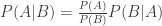
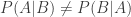
, and  play against intuition, especially in the context of massive testing and low prior probabilities. Inequality (2) here implies PPV = P(relationship truly exists | claiming a relationship) ≠ 1- P(claiming a relationship | none truly exists) = 0.95, and in particular can be MUCH smaller. To actually compute PPV = P(A|B) = P(relationship truly exists | claiming a relationship) we need to apply Bayes Theorem: